


Class Reality
Fonts


Behind the
Inspiration
Logos
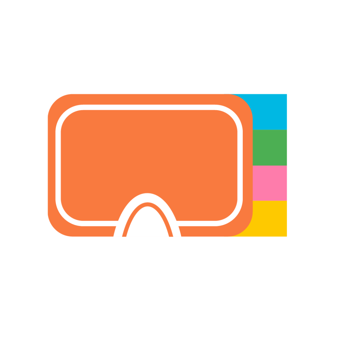
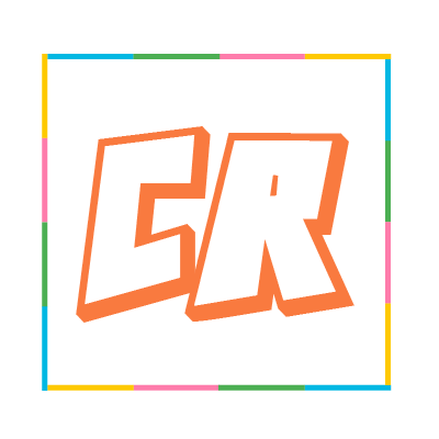
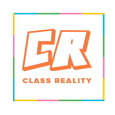
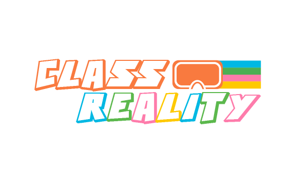
For the logo we drew inspiration from classic videogames such as Mario Kart. We wanted our logo to embody the playfulness of the Class Reality brand and represent visually the fun and entertaining nature of the app. Since virtual reality is the foundation of the application, we also wanted to represent that within the logo.
Colors
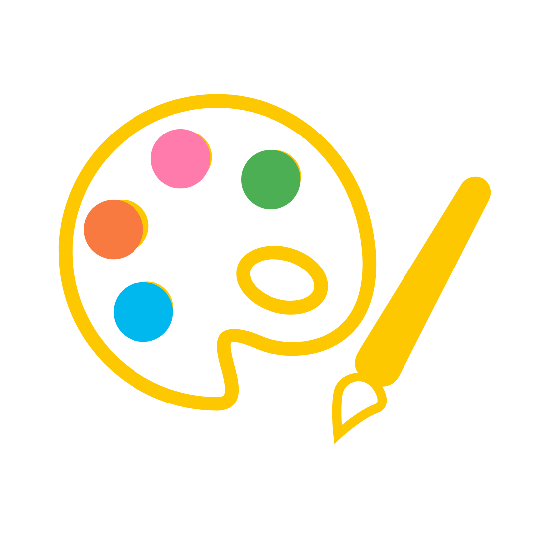
For the colors, we wanted a bright color palette that conveyed happiness and joy. We wanted to stay away from purple and techno green as those have been way over utilized in the virtual reality space. We also wanted to differentiate ourselves from Kahoot whose main brand color is purple. While primary colors are the typical choice for products in the educational space, we wanted something livelier to better communicate the spirit of our app.
Fonts
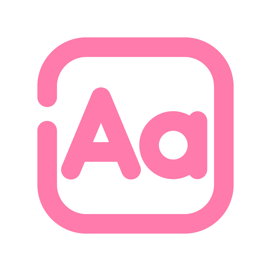
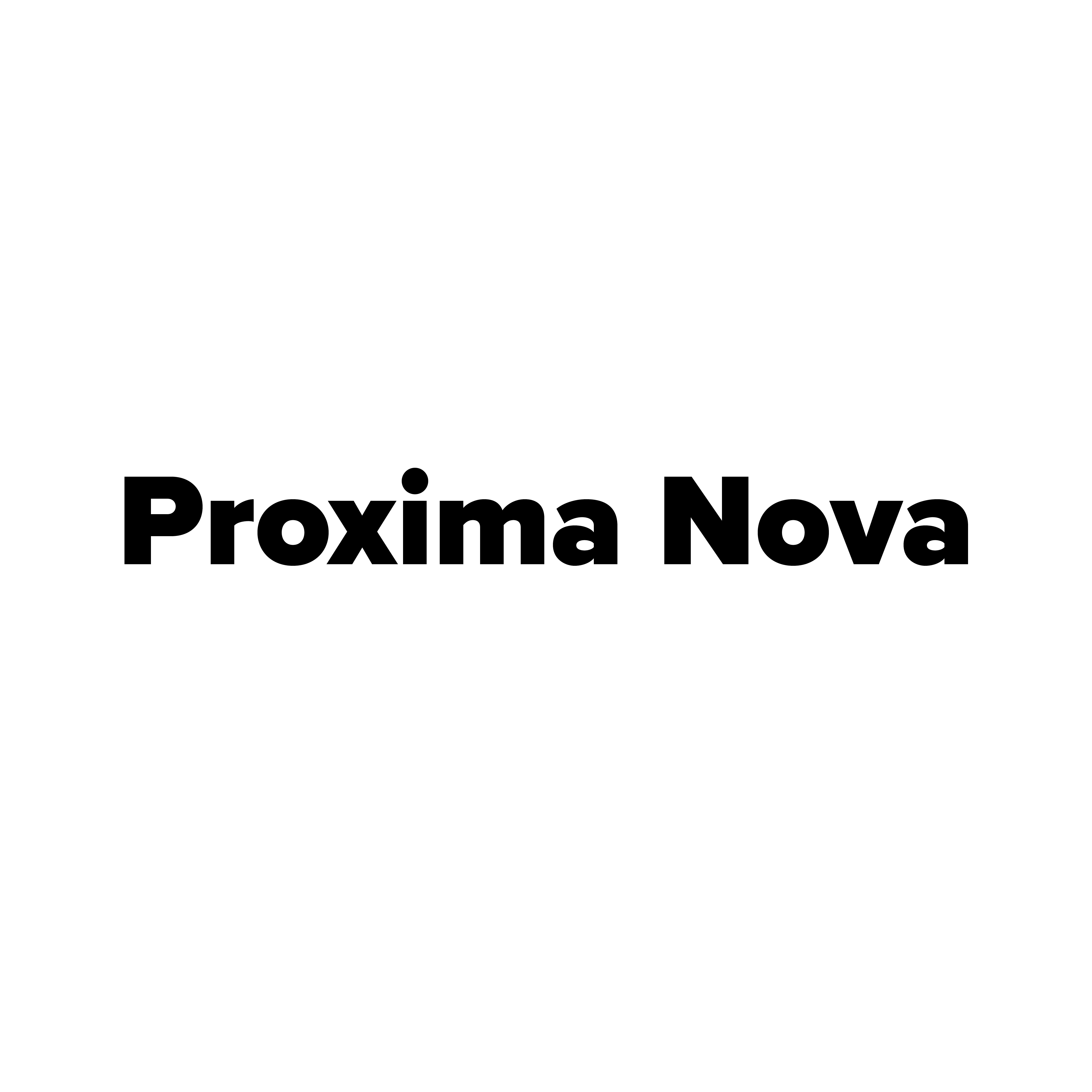
For fonts, we wanted to utilize Sans-Serif to communicate a modern, high-tech feel. The fonts we chose are sleek yet fun. We also balance the extreme bold of the header with a thin body, ensuring that the different fonts are cohesive and compliment each other.

Bringing the classroom into virtual reality.
Helpful Links
Discover our app

All rights reserved UGA New Media Institute.