


Behind the
Inspiration
Logos
In crafting our logo for Tranquil, we took inspiration from
Apple's design ethos, particularly the Apple Vision Pro
product. We aimed for a sleek, high-tech look that seamlessly
integrates into users' lives, creating a sense of belonging
within the Apple ecosystem.
Our logo embodies simplicity while incorporating subtle
dimensions. A 2022 Capstone project, Blitz, guided our
decision to prioritize the flashcard feature as the core
element of our study app. The central orange flashcard is the
main focus, with stacked layers of cards in the background to
add a touch of movement and life. Design elements from Apple
Books and the Mindfulness app and Activity rings on watchOS
also influenced our design choices.
Colors
Our color choices were influenced by Apple's visual branding,
emphasizing an immersive and calming experience. Here's our
palette:
Sunset Orange: Using
the exact HEX code from Apple's Apple Vision Pro product
website (#FF5E0C), we aim to evoke a sense of warmth,
tranquility, and attention.
Coral Reef: A nod to
the underwater immersive environment, this color adds a
calming, lighter variation of orange (#FF9864).
White: A clean canvas
for focus and clarity.
Sandstone: Subtle yet
grounding, it complements our vision of a serene environment
(#D2CCCB).
Midnight Grey:
Provides a touch of sophistication and elegance, akin to
Apple's sleek designs (#3D3D3D).
These colors aim to remind users of the tranquil atmospheres
they can immerse in while studying and pursuing their goals.
Fonts
For Tranquil's typography, we chose the system font for
visionOS - SF Pro, echoing Apple's design language. The
variations of SF Pro ensure a seamless connection to the Apple
aesthetic.
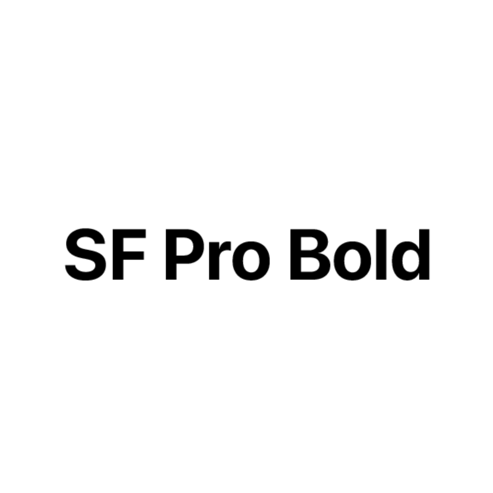
SF Pro Bold:
Size 24 Font Used in Logos, Headers, and Titles.
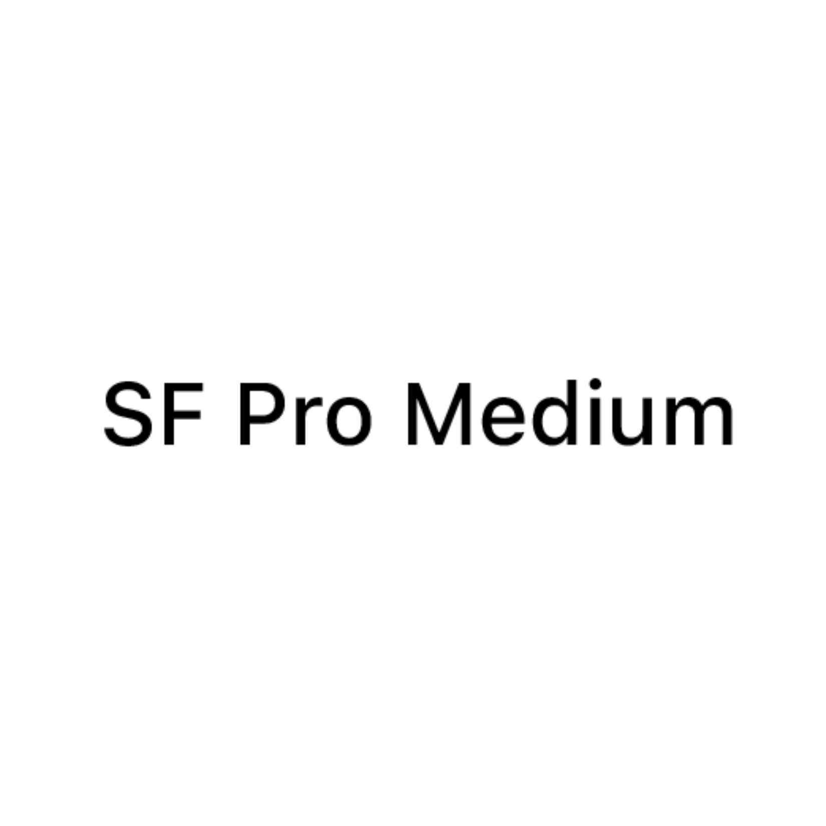
SF Pro Medium:
Size 18 Font Used in Sub-Headings and Quotes.
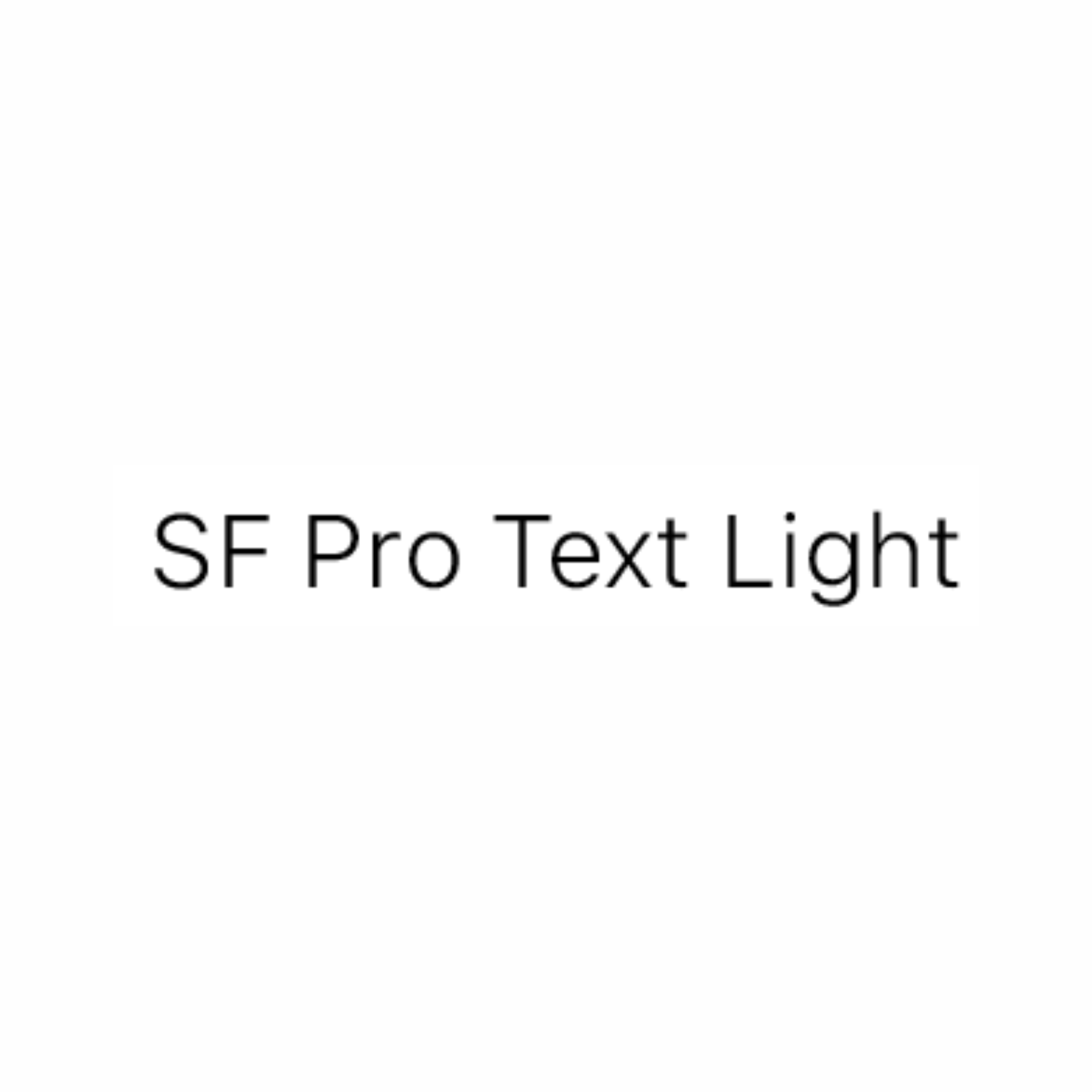
SF Pro Text Light:
Size 14 Font Used in Body Text.
These fonts embody a sleek and straightforward feel, echoing
Apple's modern and timeless design language, creating a
seamless and engaging user experience.
Final Note
In crafting Tranquil's branding, every choice was made thoughtfully, with the aim of seamlessly integrating into users' lives and helping them achieve their goals while embracing a state of tranquility. The sleek, simple logo design with a touch of dimension, paired with our carefully chosen colors and fonts, encapsulates our vision of a product that's not just a tool, but a tranquil companion on your journey to success.

All rights reserved UGA New Media Institute.