Glory Days: Before the Hedges
Visual Design Guide
Logo
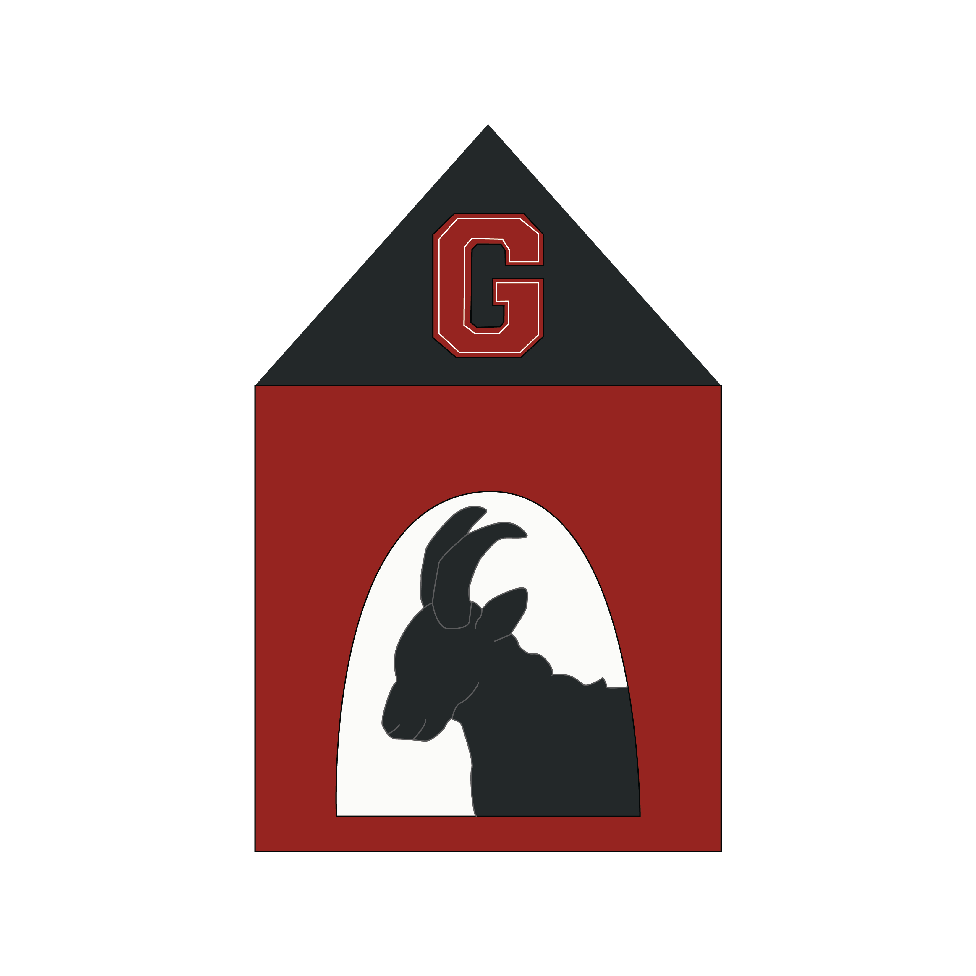
Our designed logo represents Glory Days: Before the Hedges' identity and creates a cohesive look throughout branding materials.
Color Palette
The colors chosen for the Glory Days: Before the Hedges brand combine the University of Georgia's brand style with a vintage touch to represent the history of American football.
Typography
Our headline and body fonts create a clean, readable look across all platforms.

Primary Logo
Since our mobile application is intended to open a window to the past of the University of Georgia's football program for current UGA fans, our logo was inspired by both new and old UGA football mascots. The dog house is inspired by the current day mascot's house he resides in on the sideline of home football games. The goat silhouette on the inside is inspired by the University of Georgia's first mascot. The iconic "G" is a symbol of football players who continue to "Commit to the G" to this day.
Color Palette
The colors chosen for the Glory Days: Before the Hedges brand combine the University of Georgia's brand design with a vintage style to represent the history of American football. Users new to our application will recognize the iconic red and black design while also noticing subtle accent colors that represent history and tradition.


Accent Colors
Typography
Our choice of typography creates a cohesive, readable brand identity. Our team chose fonts that are user-friendly and accesible across multiple platforms. We desired a bolder looking Sans Serif for a heading as well as a Serif and Sans Serif for body fonts. Aditionally, all of the fonts are accessible on Google Fonts.


All rights reserved Glory Days: Before the Hedges