Visual Design Guide
Color Palette
The chosen colors are representative of the calm and nurturing aspects of nature. The project uses the colors most associated with nature to connect the audience with our mission.
Cypress and Bright Pine will serve as our primary brand colors, with Sapling and Riverglass to be used as accent colors.
Any combination of brand colors may be used for text as long as it is at a minimum AA WCAG compliant. Only the pre-created logo combinations are approved for use.
Logo Usage
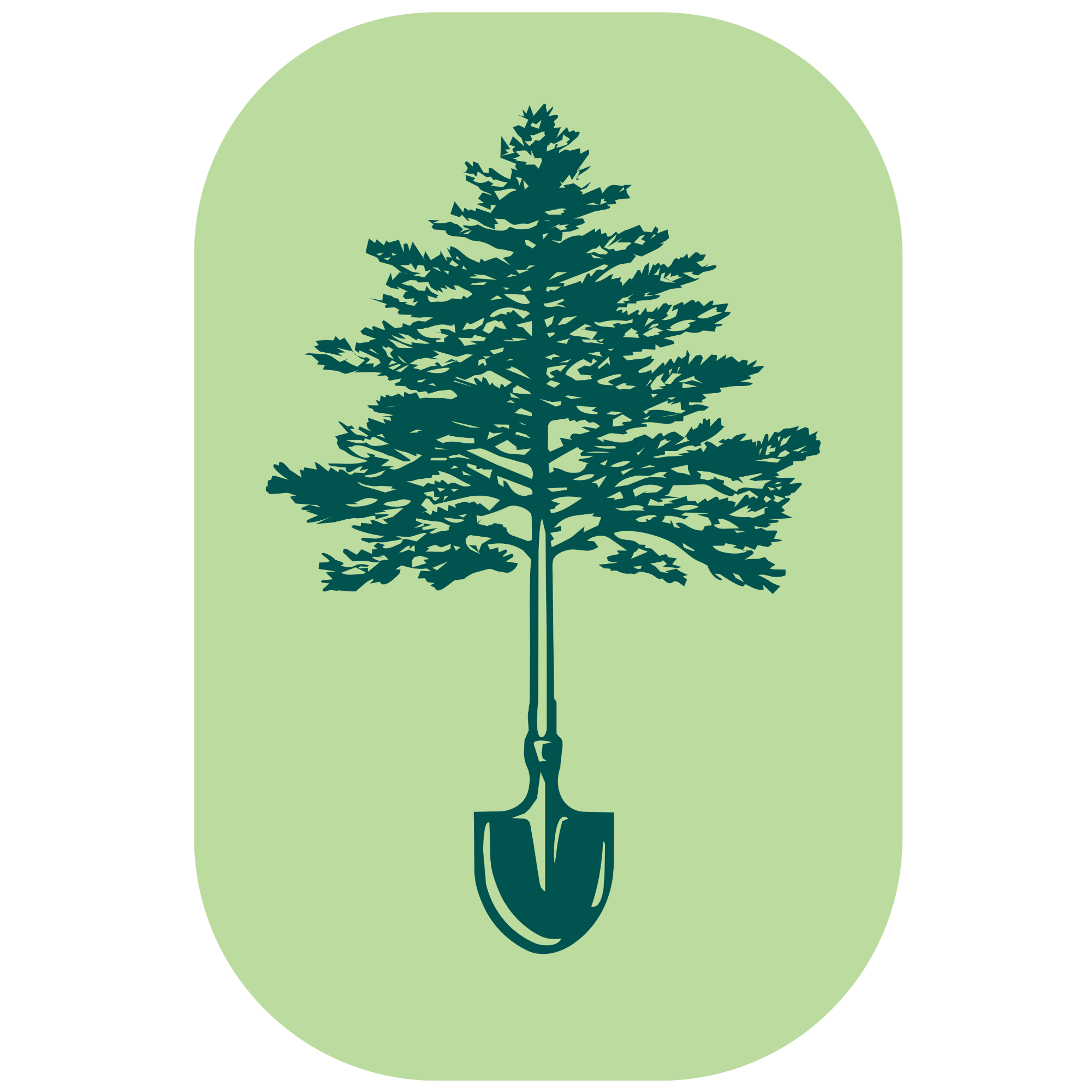
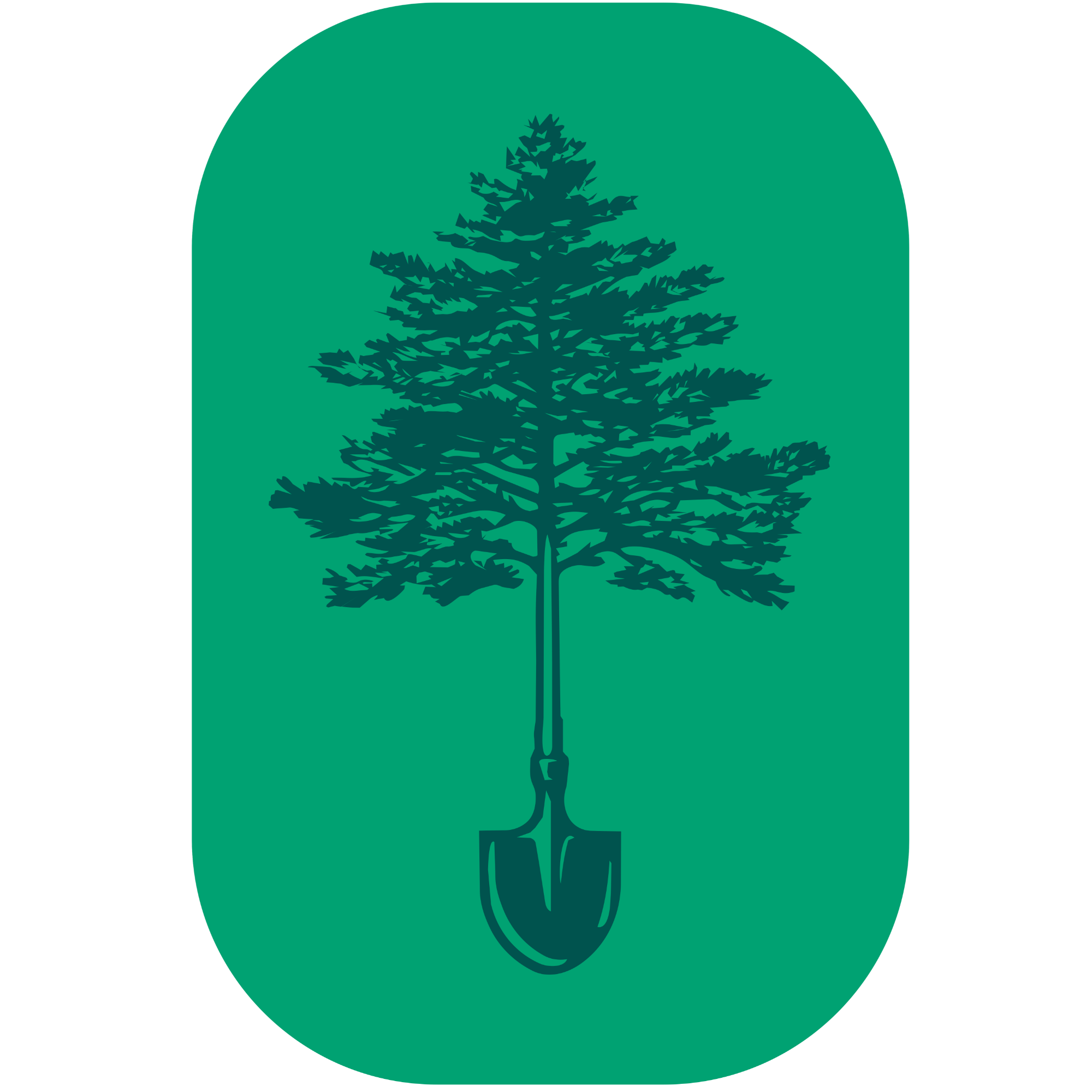
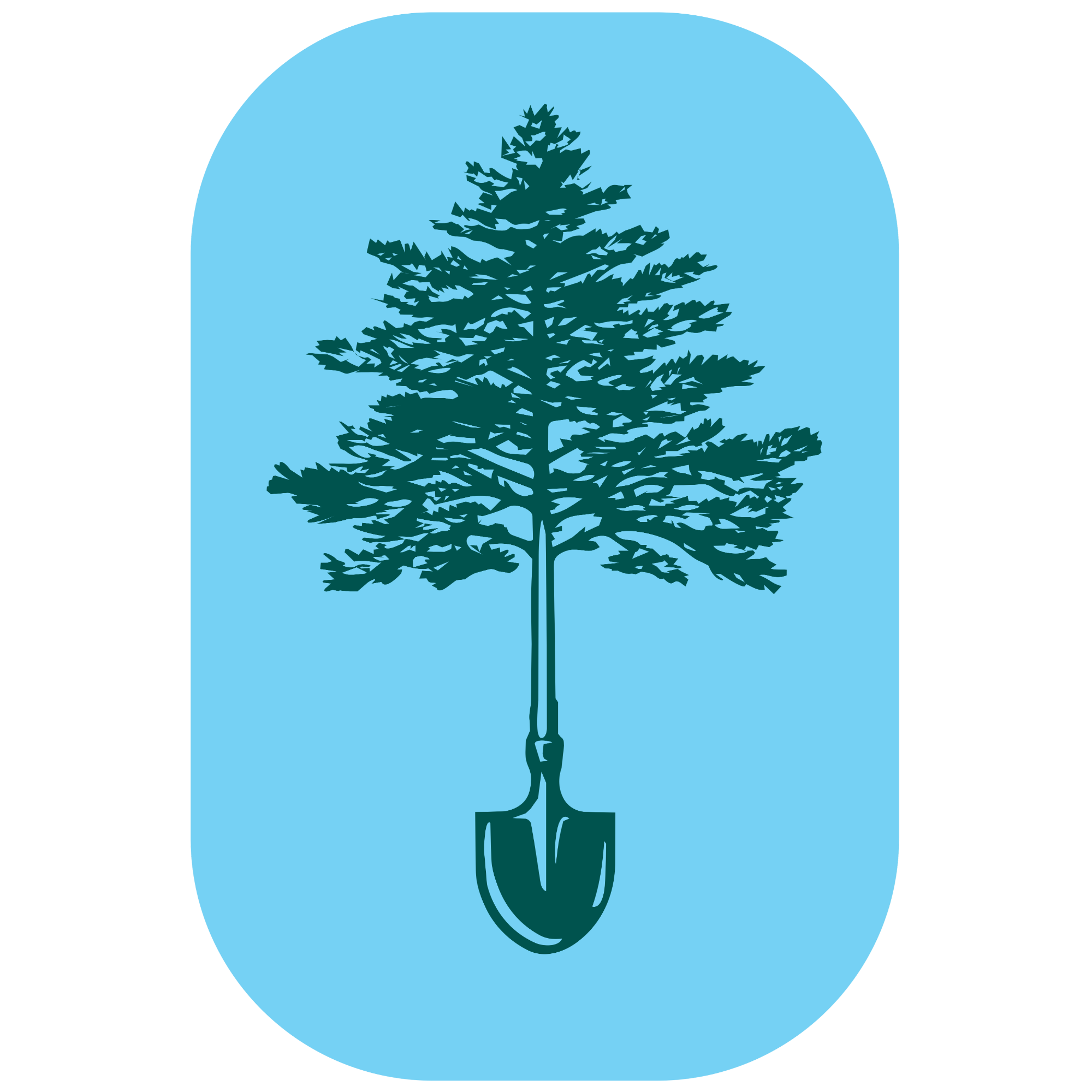
The logo carries the weight of the project’s mission, depicting a tree with a shovel at its roots. Logos should only be depicted in White or Grow Back Green.
The primary logo is horizontally weighted with a rounded bottom edge. The alternate logo options provide various combinations of wordmark and pictoral assets.
The pictoral logo options highlight the imagery of replanting trees with various color combination options. The pictoral mark should be used only when a combination mark is otherwise too large or busy.
All logos are available for PNG download by simply clicking the image you wish to download!
Typography
Inlander is a visible, modern sans-serif font that should be used in only the logo and large title text.
Acumin is a modern sans-serif font that should be used for various headings and subheadings. It should only be used in all uppercase and with a high letter-spacing.
Merriweather is a readable, modern serif font that should be used for lower class subheadings (bolded), body text, and longer passages of content.

Make something work. Then, make it work better.
All rights reserved UGA New Media Institute.