Round Badge
Best for social graphics, profile images, and quick brand recognition moments.
Franklin GPT Brand System
This guide captures the visual identity for Franklin GPT and Frank the AI Dawg. It provides logo display space, core brand colors, and a simple reference system for keeping future slides, prototypes, posters, and project materials visually consistent.
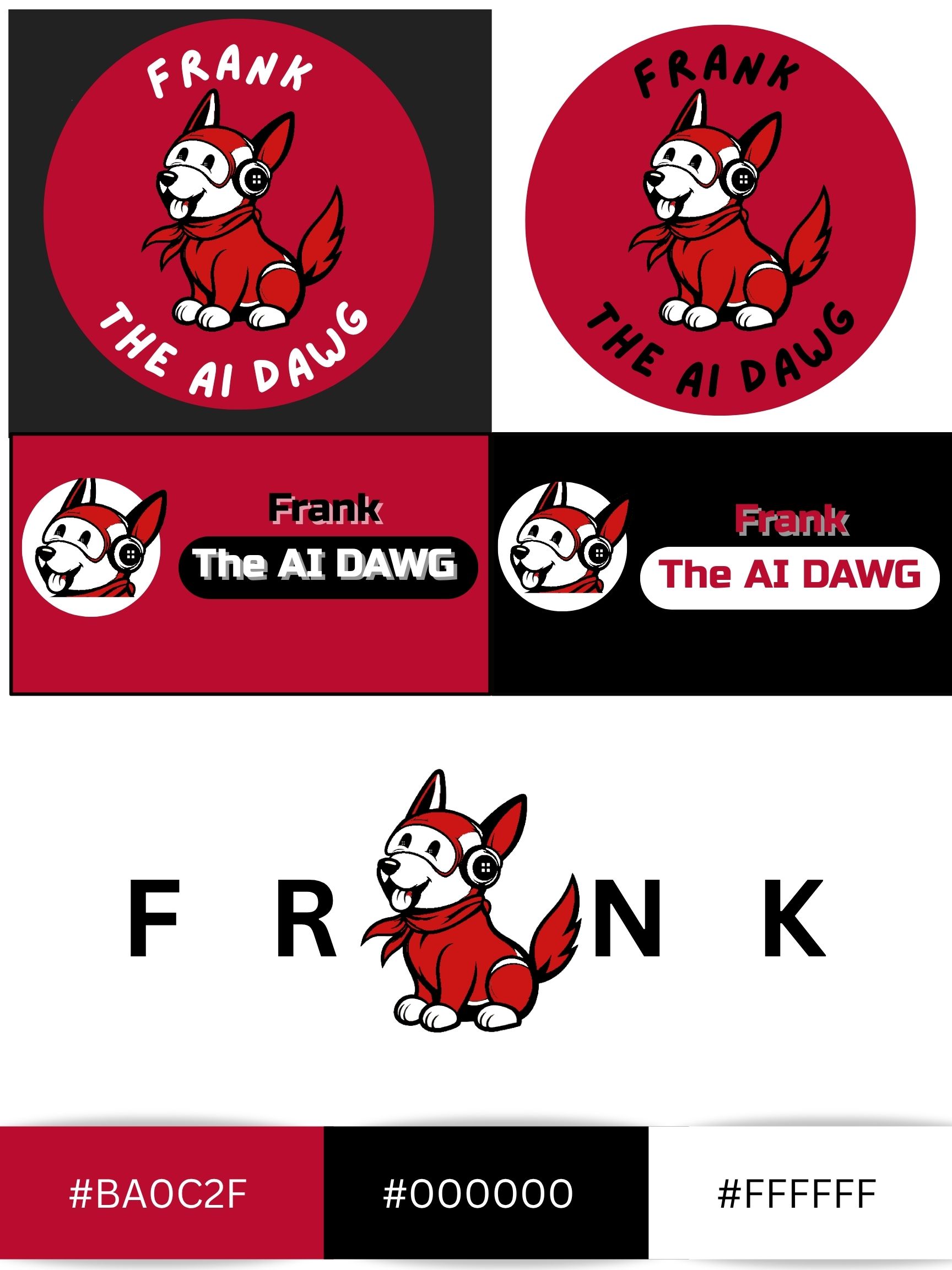
Use these panels to present the main Franklin GPT brand marks. They give you clear space for the mascot logo, round badge, and wordmark-style lockups on dark, light, and red backgrounds.
Best for social graphics, profile images, and quick brand recognition moments.
Best for presentations, posters, and sections where Frank is the visual focus.
Use for branded title slides or guide pages where the red identity needs to lead.
Works well for darker backgrounds and more dramatic presentation treatments.
Need everything at once? Download the full Franklin GPT logo bundle with PNG, SVG, and reference assets.
Download All LogosThis area gives you a clean branded lockup section inspired by your sample board. It can be reused in documents when you want Frank paired with the project naming system.
Frank
The AI DawgThese are the primary colors already reflected in the Franklin GPT site and mascot branding. Keep these values consistent across web, print, slides, and supporting materials.
Primary brand accent used for emphasis, hero treatments, buttons, and major highlights.
Use for contrast, structure, outlines, bold text, and dark logo applications.
Primary readable background color and the main space for body content and document layouts.
Franklin GPT works best with bold, high-contrast headings and highly legible body copy. The visual voice should feel technical, confident, and easy to scan.
Hero / Display
Franklin GPT
Use extra-bold, uppercase display text for hero titles, section intros, and key poster moments. Keep tracking slightly expanded for a futuristic feel.
Use strong sentence-case or title-case headings for cards and page sections. Headings should feel clear and structured rather than decorative.
Franklin GPT is designed to help advisors and students find relevant coursework, policy, and campus support information quickly and consistently.
Body text should stay on white or lightly tinted backgrounds with generous line height. Prioritize readability over visual effects in long-form content.
UGA-focused guidance, powered by AI.
Monospaced or system-mono accents can be used sparingly for futuristic callouts, taglines, or UI-inspired labels.
Buttons should feel crisp, bold, and high-contrast. Rounded pill shapes work especially well with the current Franklin GPT interface style.
Use red gradient buttons for main calls to action such as launch points, downloads, and section navigation.
Use a soft red-tinted button for supporting actions that should stay visible without competing with the primary CTA.
Use black buttons when you need stronger contrast or a more formal supporting action in documents and guides.
These components reflect the current Franklin GPT site direction and can serve as a lightweight visual reference for future interface decisions.
UGA-Focused Guidance
Franklin GPT
Support academic advising with faster access to relevant policies, coursework, and campus resources.
Use dark red gradients, strong display text, and concise supporting copy for high-impact top-of-page sections.
Summarize one core capability or outcome in a short card with an icon, a tight heading, and one to two lines of supporting text.
Cards should have soft corners, restrained shadows, and enough whitespace to feel polished and legible.
Keep contact information stacked, readable, and link-friendly so long email addresses and profile links don’t get cut off.
Keep the visual system simple and consistent so Frank feels recognizable across every project touchpoint.
Use these quick examples to keep the Franklin GPT brand system clean, legible, and consistent.
Use the primary lockup on dark, clean backgrounds when you want strong contrast and clear recognition.
Use white or lightly tinted backgrounds for longer reading sections, documentation, and body-heavy layouts.
Do not place logos on busy or low-contrast backgrounds where the mascot and wordmark become harder to read.
Do not introduce unrelated accent colors that compete with the core red, black, and white brand system.