

Dog Doctors
Logos
We designed this logo to display the purpose of Dog Doctors. The paw print is emblematic of dogs being the focal point of the outreach program, and is strategically centered around a heart. The heart was turned upside down to mimic the palm of a dog's paw.
Choosing the heart as a key part of our design also has an underlying meaning. As part of the program curriculum, students are educated on how the heart works, from pumping blood to measuring heart beat. The electrocardiogram line allows for these themes to all be touched upon in our design. As per the request of our client, we have included the program's name.
We chose to use Intro Rust as the logo’s font because bold sans serif font choices are easily readable and imitate block letters, which resonate with kids. The alignment of the differing text sizes achieves a polished look through the utilization of the rule of thirds.
Full Logo- Black
The vertical layout of this logo is ideal for spaces where we can showcase the Dog Doctors name, and establish a strong and clear identity for our project and brand.

Outreach Logo- Black
This logo's vertical orientation is expertly designed for instances where a more compact representation is necessary. Our client specifically requested a variation that includes the full name, "Dog Doctors Outreach," to use in formal presentations and official communications where the complete identification of the initiative is essential.

Horizontal Outreach Logo
The horizontal design of this logo is perfect for banner displays, website headers, and printed materials where a landscape orientation is optimal. It offers a sleek and clear representation of the Dog Doctors program, ensuring brand recognition across various platforms and promotional channels..
Full Logo- Red
This icon design is designed to be used across a variety of platforms and materials, offering a distinct visual identifier for the program without the need for accompanying text. The red variant will be used on graphics or videos when the black variant is hard to read.
Paw Print Logo
This icon design is ideal for situations requiring a vertical layout or as a standalone graphic when the project's name isn't necessary. It's well-suited as a striking favicon for web presence, ensuring the Dog Doctors program is instantly recognizable in any digital context.
Dog Doctors
Colors
Because Dog Doctors stems from the UGA School of Veterinary Medicine, we decided to adhere to the university color palette. We stuck to their red, light gray, black, and white codes to drive home the hub of scientific innovation that the Dog Doctors team stems from.
Black
#000000
Light Gray
#F4F2F0
Red
#BA0C2F

White
#FFFFFF
Dog Doctors
Fonts
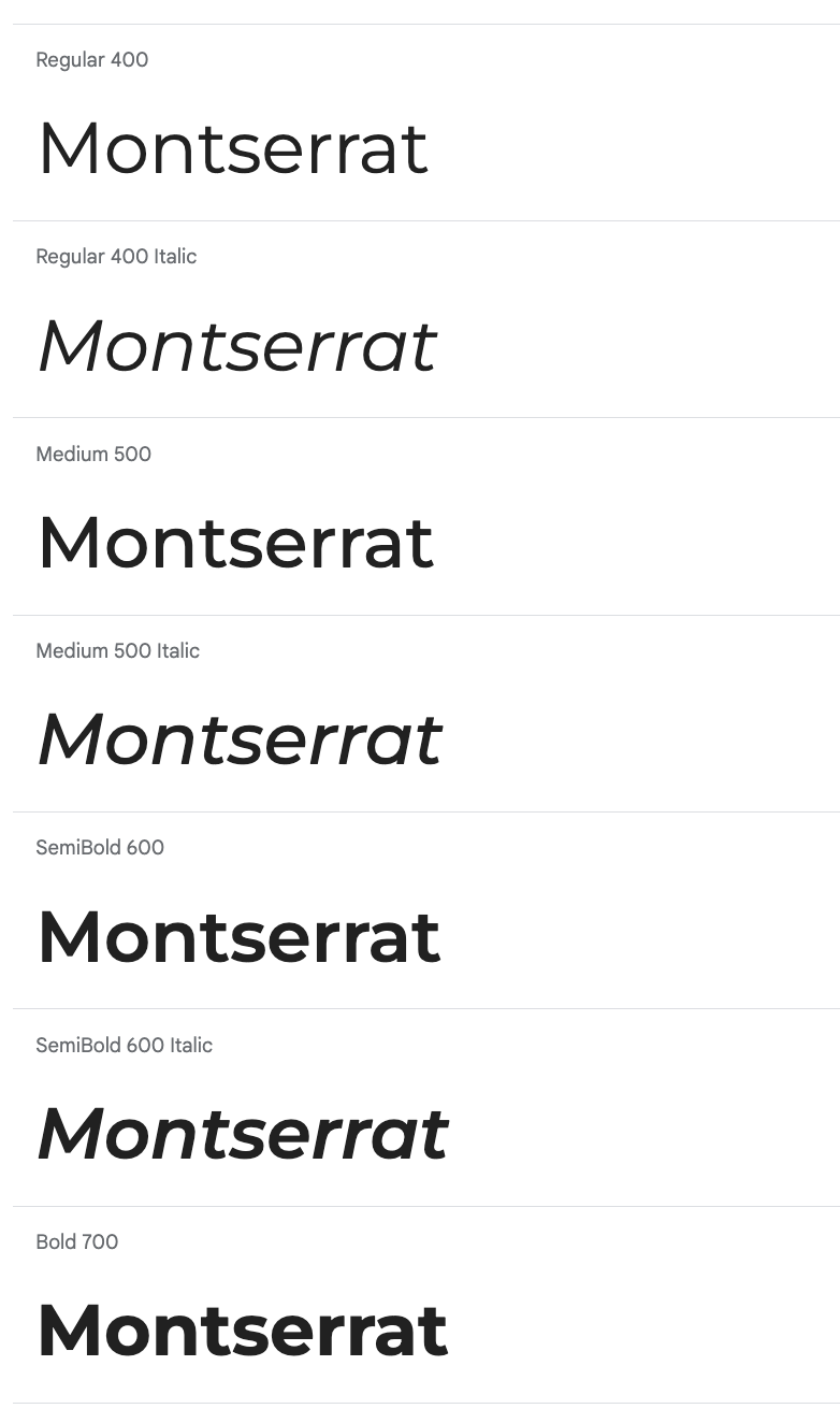
The wide, clean typeface of Montserrat ensures strong readability on various print and digital media. The horizontal emphasis of the letters also allows for visibility at small and large font sizes.
We plan on using Bold 700 for headlines, and Regular 400 for body text.
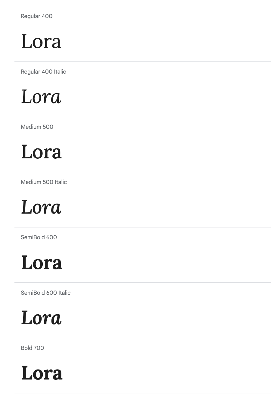
For stylistic touches, we landed on Lora to maintain a level of clean design and similar readability as Montserrat. Regular 400 Italic as sub-headings offers enough of a visual contrast from our headings and body text, without leaning too much into distracting typeface.
All rights reserved UGA New Media Institute.