
Wayusada
Visual Design Guide

Logos

Colors

Fonts

Inspiration

Wayusada
Logos
The name Wayusada references a Kichwa cultural ritual in the
Amazon jungle in which participants drink wayusa, a natural
drink from the wayusa leaf, in the morning and discuss their
dreams from the night before. The name reflects the intersection
of culture and nature through the way that indigenous people in
the rainforest interact with theirenvironment. Our logo also
reflects this concept by incorporating a natural element, a
leaf, with a cultural element, the silhouette of a woman, inside
of it. Logos for digital platforms should be at a lower
resolution for faster website loading. Logos for printed
materials should be at a higher resolution. Use PNG format when
possible for the best quality.
Horizontal Light Background
This horizontal design is used when space allows for the
full name, and when more context is needed to support our
icon design and establish our project. This orientation is
used to establish our website.
Horizontal Dark Background
This horizontal design is used when space allows for the
full name, and when more context is needed to support our
icon design and establish our project. This orientation is
used to establish our website.
Square Light Background
The square logo orientation is used when more space is
available, such as on printed materials or as a dominant
centered element.

Vertical Light Background
This icon design is used when space allows only for a
vertical orientation, or as a design element when the name
of the project is not needed. If used alone, the icon
should come with surrounding context that distinguishes
the project. For example, the icon can be used as a social
media profile picture or as a design element on the
project’s poster.

Vertical Dark Background
This icon design is used when space allows only for a
vertical orientation, or as a design element when the name
of the project is not needed. If used alone, the icon
should come with surrounding context that distinguishes
the project. For example, the icon can be used as a social
media profile picture or as a design element on the
project’s poster.
Wayusada
Colors
Our palette was inspired by the people, landscape, and flag of
Ecuador and its Amazon rainforest. The shades of green mimic the
greenery of the jungle, while the earth tones reflect the people
that have shaped the ecological legacy of the rainforest. The
undertones of red, yellow and blue in some of the shades are a
subtle nod to the three colors in Ecuador’s flag. The darker
green hues are best for background elements, while the yellow,
orange and red serve as accents.

Canopy Green
#16644A

Blue Water
#04937A

Wayusa Leaf
#95D184

Macaw Feather
#F6DB8D

Wituk Painting
#E35B1C

Cinnamon Bark
#581002
Wayusada
Fonts
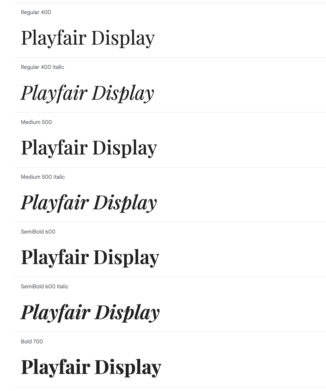
For headings and subheadings, variations of this serif Google
font give a textbook feel, reminiscent of the historic
textbooks that our client, Dr. Fausto Sarmiento, still has
from his father. 700 bold is best for main headings and a
lighter weight can be used for subsequent subheadings.
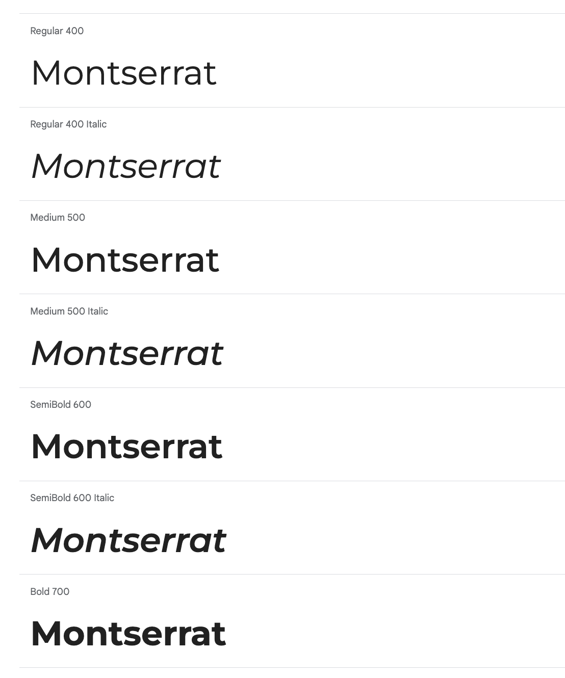
A simple but sleek sans serif google body text font that is
easy to read in our copy, and that pairs well with our serif
heading choice. The regular weight is used for body text.
All rights reserved UGA New Media Institute.