
Wild Earth Camp
Visual Design Guide
Graphic Elements
A compilation of Wild Earth Camp's logos and visual imagery.
Colors
The color palette use throughout the Wild Earth Camp and all external paraphernalia.
Typography
Headings, subheadings, and text fonts used in all Wild Earth Camp media.

Graphical Elements
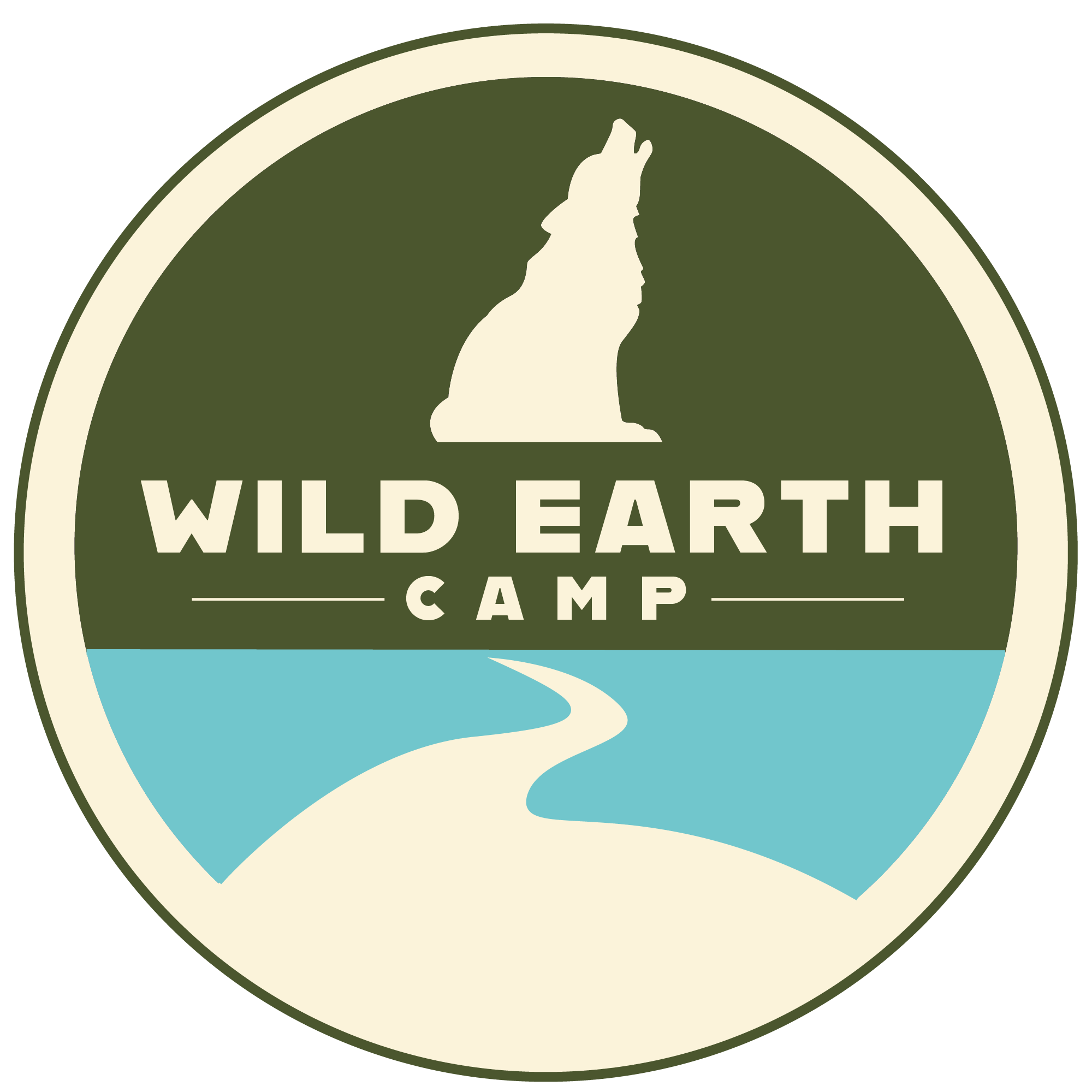
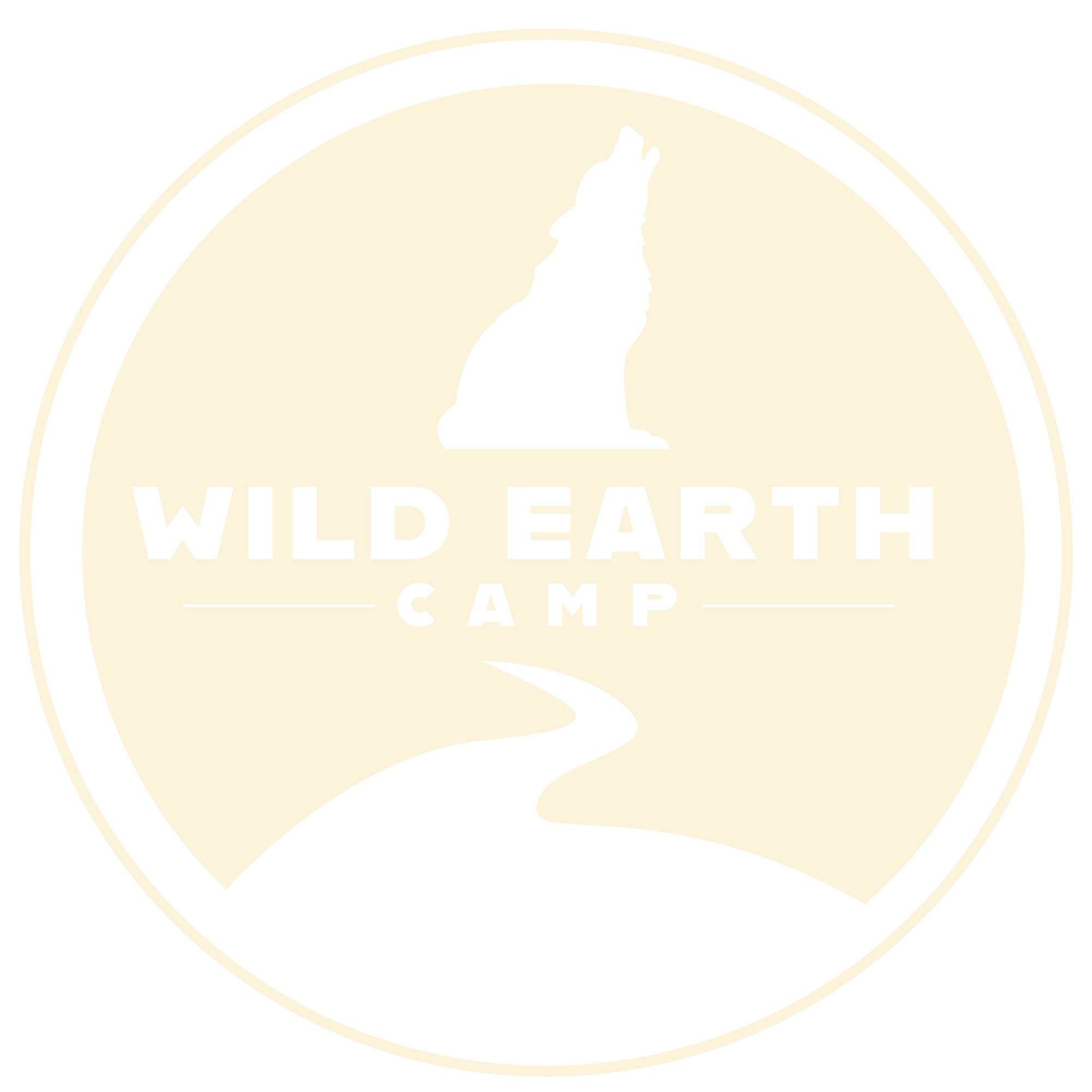
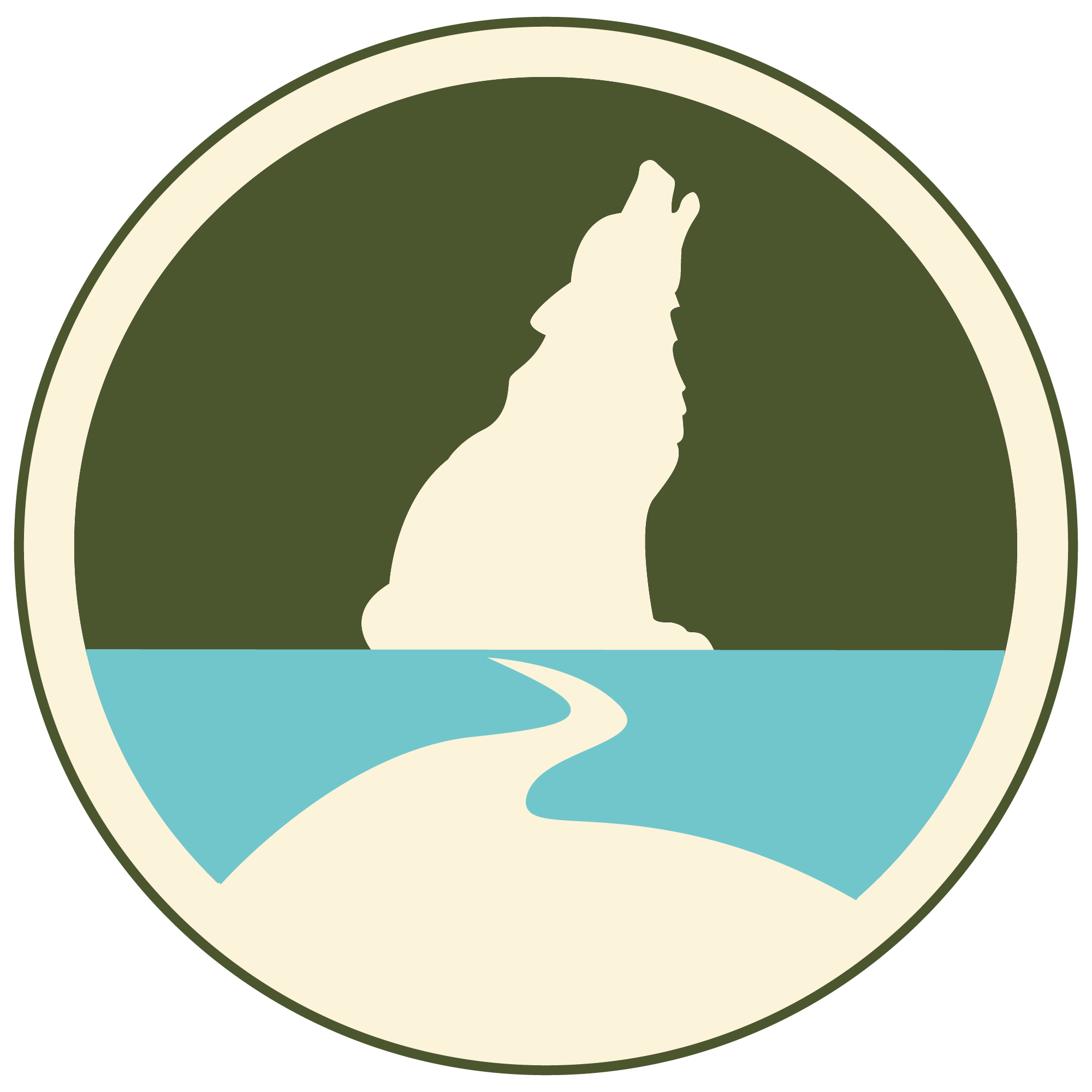
In the preliminiary sketches Laura showed us for the logo, they were all circular and included a river element. Laura also mentioned that Wild Earth Camp utilizes Coyote Teaching, a form of learning to live by example, with the kids during camp, and she wanted to incorporate that somehow in the logo. As a result, we ended up incorporating the silhouette of a coyote to symbolize the Coyote Teaching Wild Eart Camp uses. We also included a river to symbolize the creeks on the land.
Primary Logos
Logo should only be used in the brand's colors, dark gray, or off-white; no other colors are allowed. Dark Gray logo should only be used on top of light colors like the off-white and beige brand colors. The off-white logo should be used on top of dark colors like the brand's dark green, light lue, light green, and brown colors.
Main Logo
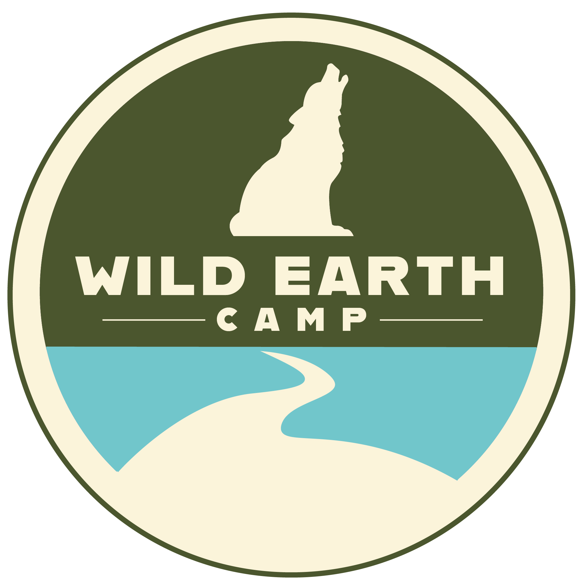
Dark Gray Logo
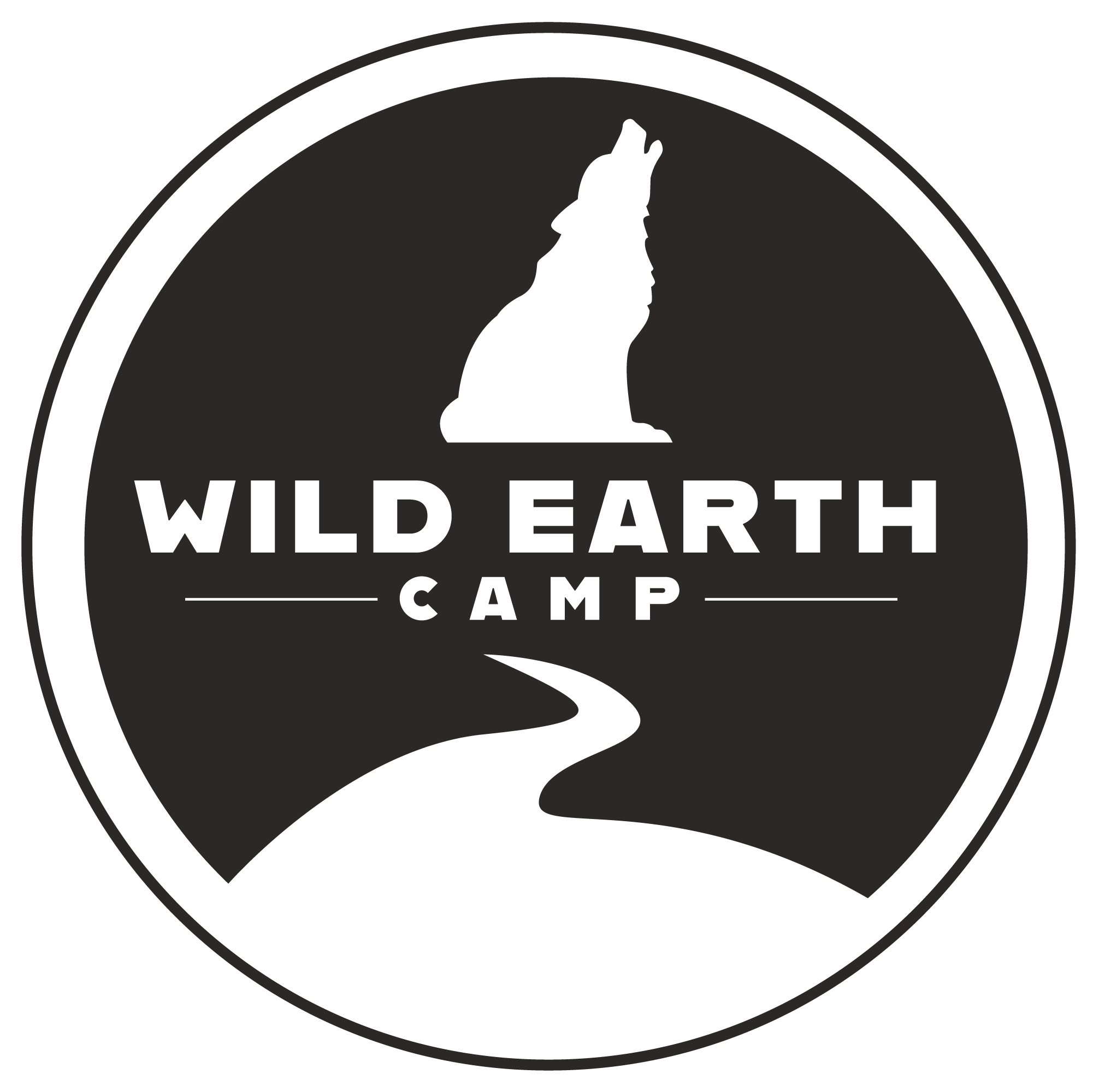
Monochromatic Logo
Secondary Logos
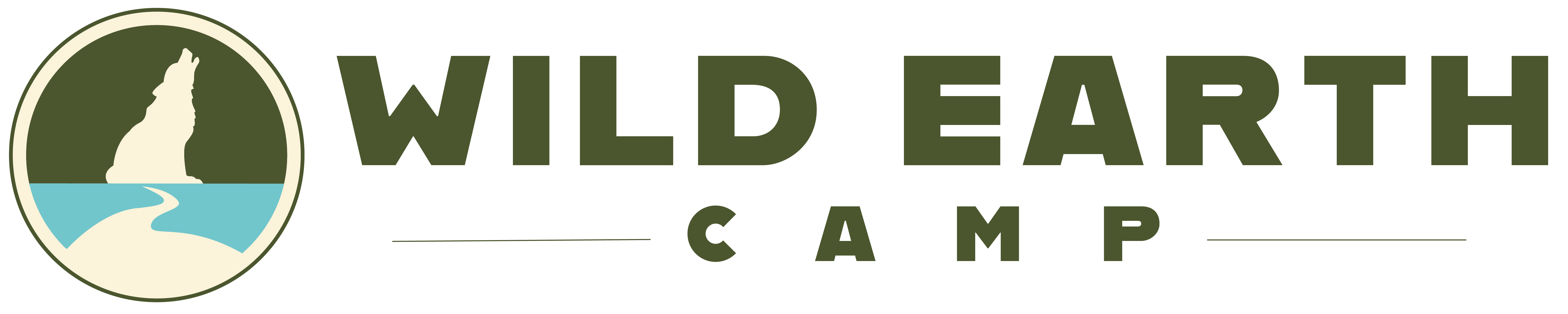
The secondary logos for Wild Earth Camp include vertical and horizontal versions as well as a version with no text. Horizontal logo can be used in places like the website's nav bar. The no text version can be used in instances where there is not enough space for the full logo.
Vertical Logo and Text
Horizontal Logo and Text
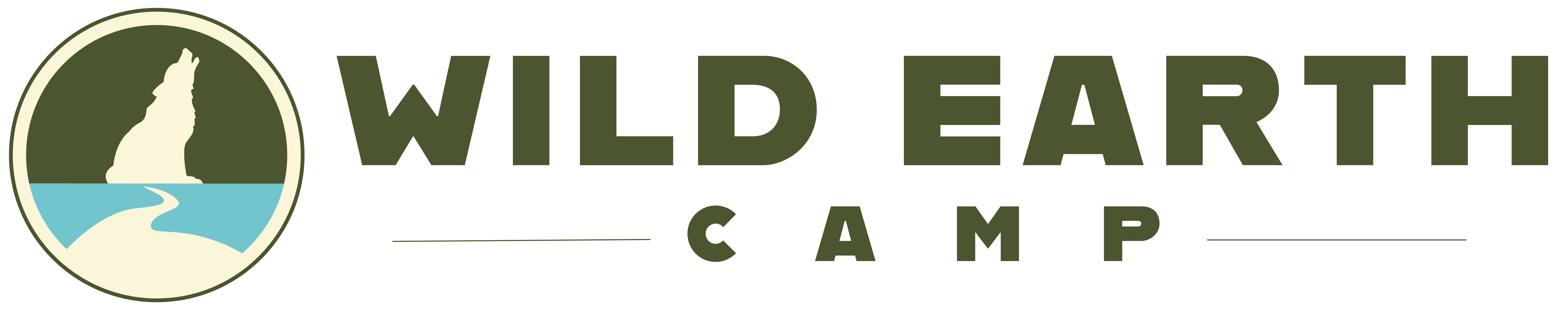
Colors
The inspiration for the brand's colors come from the land Wild Earth Camp is located on. We wanted Wild Earth Camp to have an earth color palette, so we added greens, browns, and a blue similar to the colors found on the land.
Primary Colors
Dark Green
- #4b562e
- R75 G86 B46
Light Blue
- #71c6cc
- R113 G198 B204
Beige
- #fdf9ed
- R253 G249 B237
Secondary Colors
Light Green
- #93b766
- R158 G183 B102
Brown
- #654e2a
- R101 G78 B42
Neutral Colors
Off White
- #fffefc
- R255 G254 B252
Dark Grey
- #2b2827
- R43 G40 B39
Typography
When looking for typefaces, we wanted something modern yet fun that is similar to the playfu nature of Wild Earth Camp. We chose Domus Titling Extra Bold for headings, Domus Titling Medium for subheadings, and Omnes Regular for body text. Domus Titling is a more rounded, sans serif typeface which creates an inviting feeling. Omnes Regular is also a sans serif typeface and its round and simplistic nature allows for easy reading and is thus good for body text.
Headings: Jua(Size:100, Weight:800)
Subheadings: Nunito Bold(Size: 60, Weight: 700)
Body Text: Nunito Regular(Size: 30, Weight: 500)
Make something work. Then, make it work better.
All rights reserved UGA New Media Institute.